Hey There,
We’re happy to announce a few UI improvements for our control panel when viewed via a Mobile and/or Tablet device.
With this CrownPanel update, we’ve made some improvements on UI for the Mobile/Tab view, this update includes a number of improvements that will help you navigate and more smoothly.
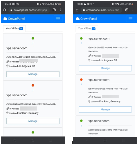
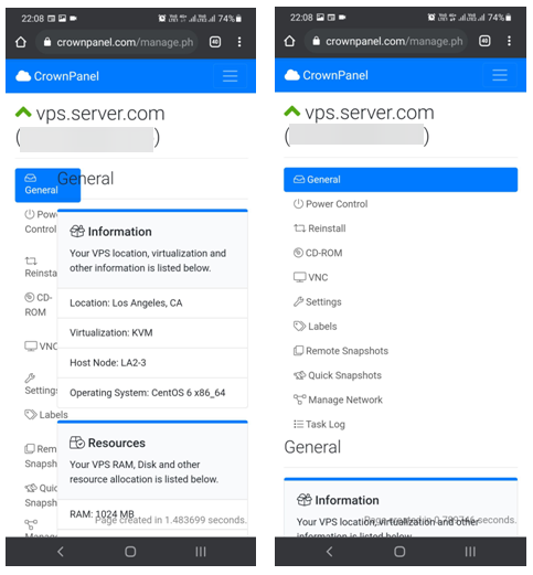
Here are some of the snapshots of the Control panel,
Home page:
Manage Page:
As seen in the above screenshots, we can see some of the improvements made to the Home page and VPS manage page layout to prevent elements from overlapping each other, giving the page an overall much cleaner look.
We’ve received amazing feedback from our beta test users. We’re happy to release these improvements to all users today.
Let us know if you have any thoughts or feedback to make it better. Our support team is all ears for your feedback/suggestions!
Stay tuned for more updates!
Follow us on CrownCloud Blog, Twitter, and Facebook for updates regarding current offers and other updates.


Comments
Comments are closed.