Hey There!
We’ve been working on a new design for our control panel and we’re glad to unveil the first redesigned feature today — Snapshots!

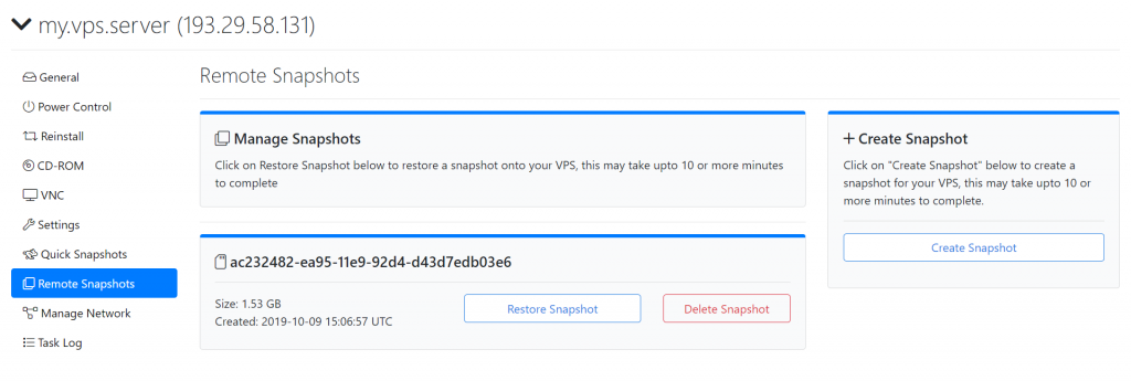
As seen in the above image, we’ve redesigned out the snapshot interface to be clearer and more informative while making good use of the space available.
The first thing you see is the long character-numeric string, the snapshot-UUID, this is vital when trying to address the snapshot with when using our API (more information soon!)
Below which you see the size of the snapshot, ideal to compare with if the snapshot has been built correctly, below which finally you see a timestamp of when the snapshot was created
Last but not least, the buttons! You see the 3 buttons, one to restore and one to delete the snapshot, the delete snapshot button has been marked in red, simple yet effective, while the restore and create snapshot buttons remain in blue.
We hope you’re as excited as we are with the upcoming panel redesign!
Stay tuned for more previews of the new design!
Comments
Comments are closed.